
Summary
Problem Statement
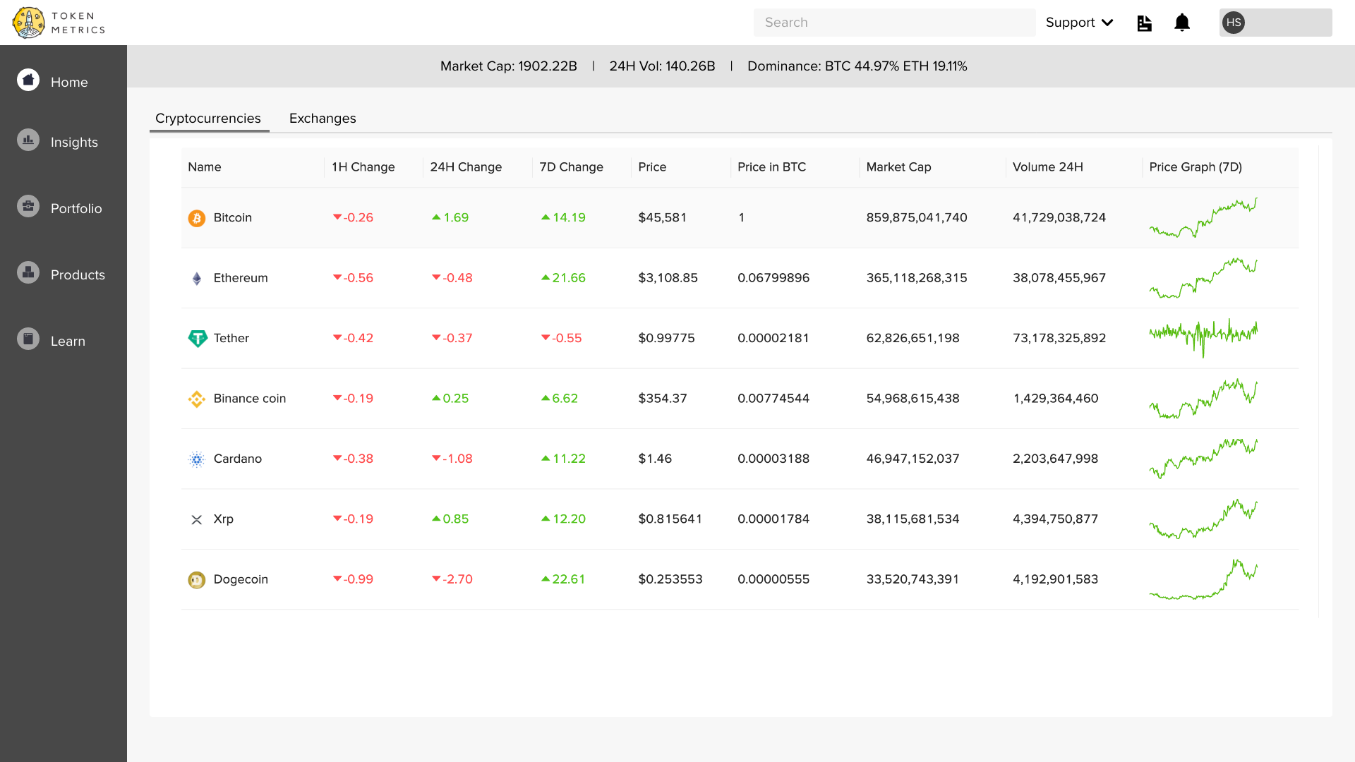
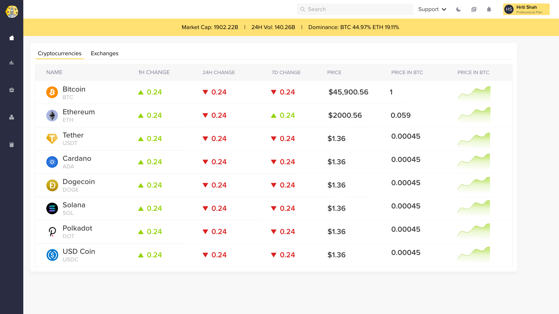
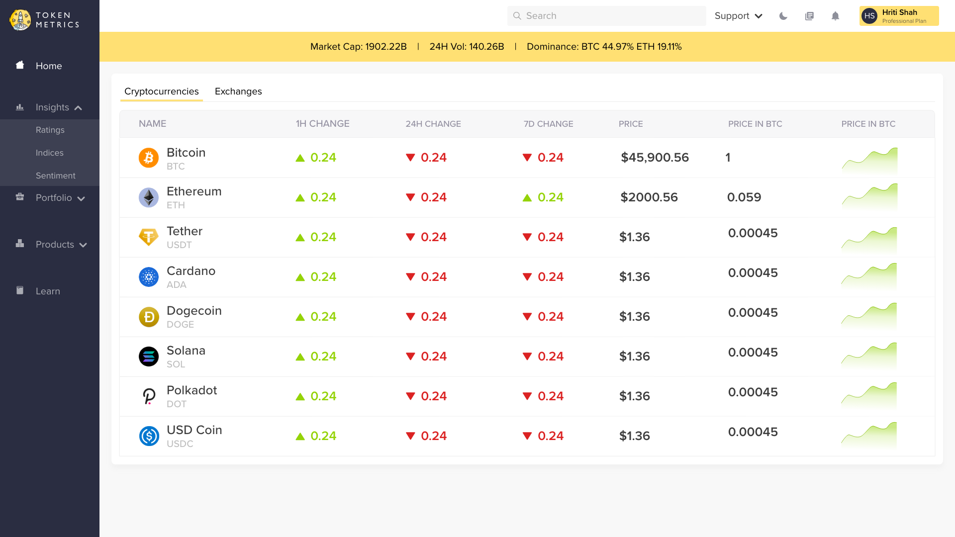
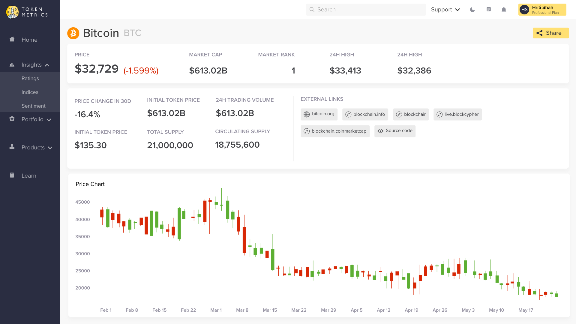
Token Metrics' flagship product, the cryptoanalytics dashboard had not been touched upon and had many UX issues that began to surface. Thus, to allow the users to understand the complex world of cryptocurrency and to make the most out of the dashboard, a complete revamp was needed
Solution
To enable the users understand the complex world of cryptocurrencies, we redesigned the dashboard completely. We restructured the information architecture, refined the visuals, and also added additional information to help users make informed decisions about their investments.
My Role
Lead UX Designer
Date
June 2021 - September 2021
Team Members
Hriti Shah, Veera Budhi, Paul Doan, Sara Jin
Tools
Sketch, InVision Studio, Google Forms
My contribution
As the sole UX Designer, during the research phase, I conducted interviews for 30+ users. I also created and analyzed the quantitative data of 250+ users in collaboration with the marketing team.
During the design phase, I created a revised information architecture to group information intuitively, sketched paper prototypes, and created the low-fidelity and high-fidelity prototypes.
Our Process
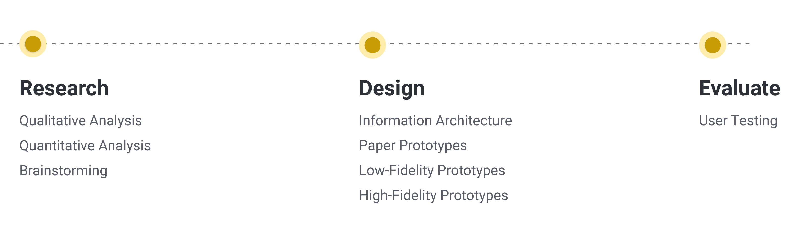
Our Process
The results
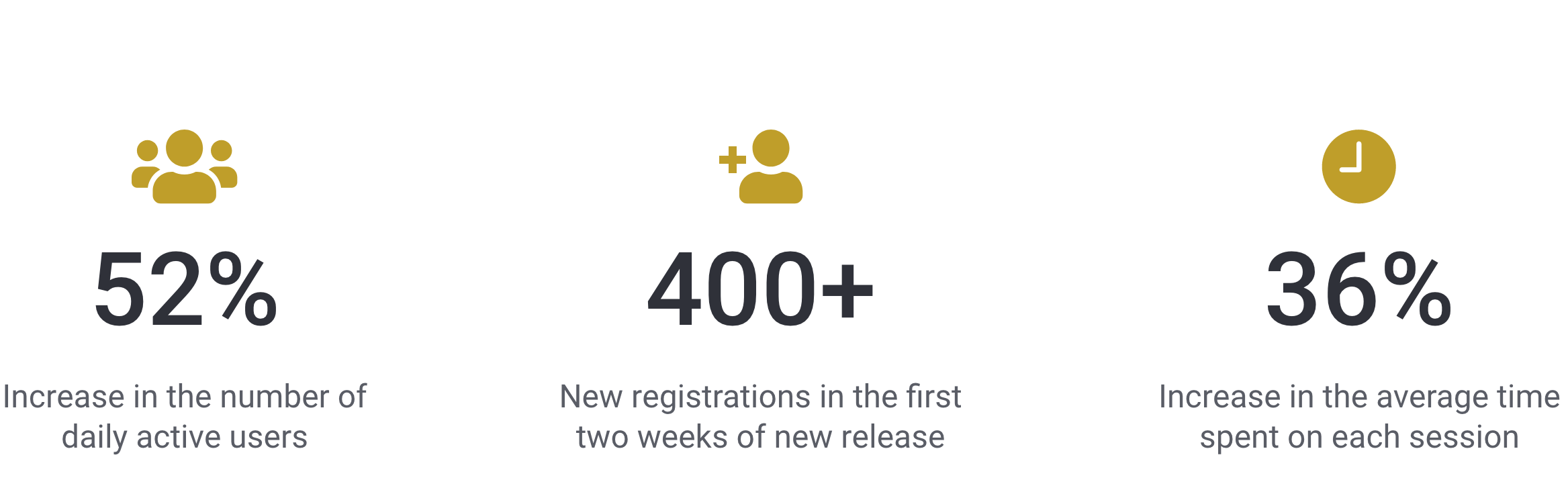
Results
Research
Qualitative Research
In order to get started with the design process, we conducted 30+ user interviews to get qualitative insights and understand users’ pain points.
We recruited 5 users from each plan offered by Token Metrics - HODler, Investor, and Professional.
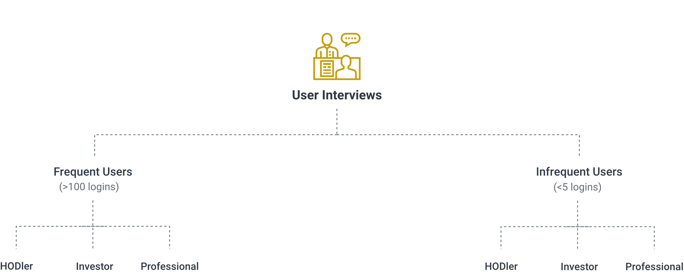
User Interviews
After conducting the interviews, we consolidated the insights by creating user stories.
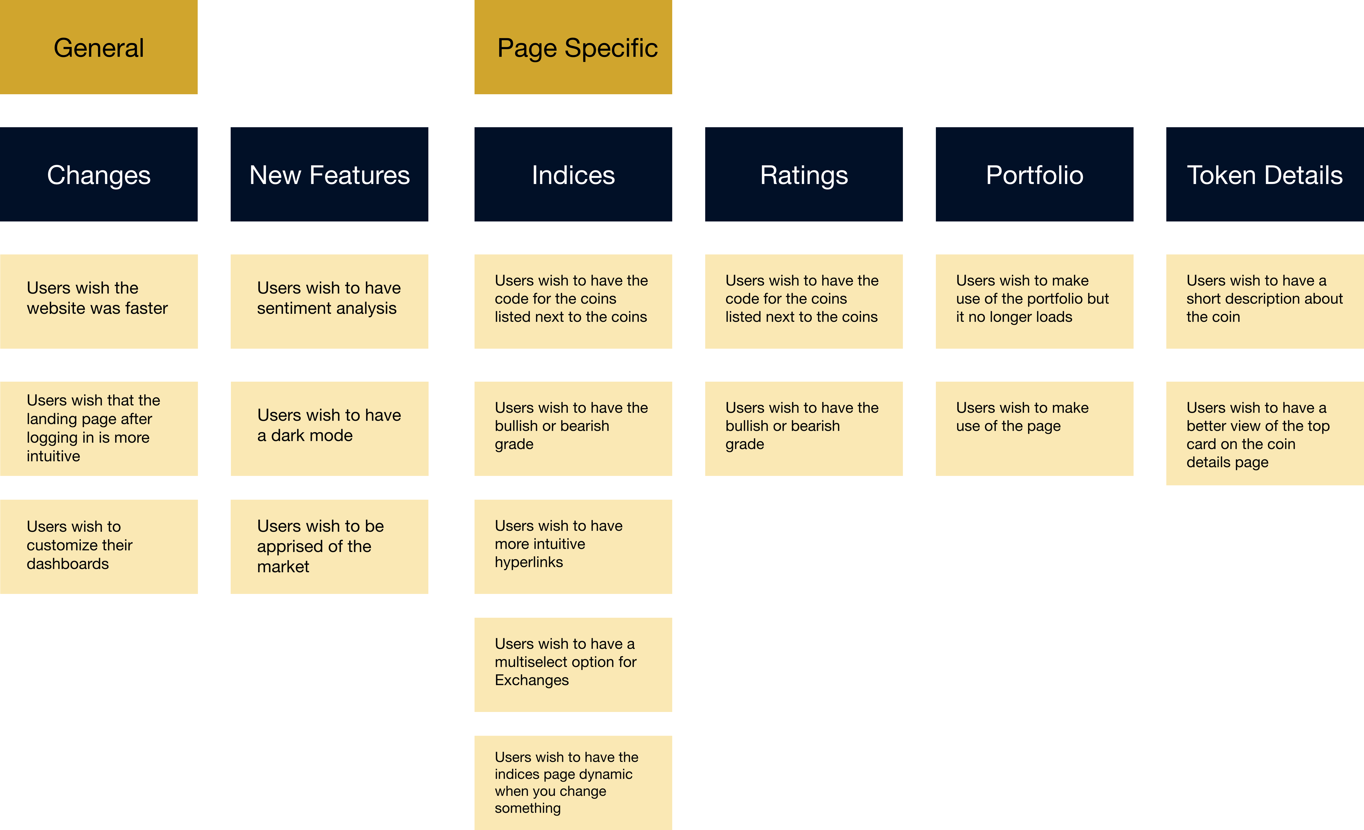
User Stories
Quantitative Analysis
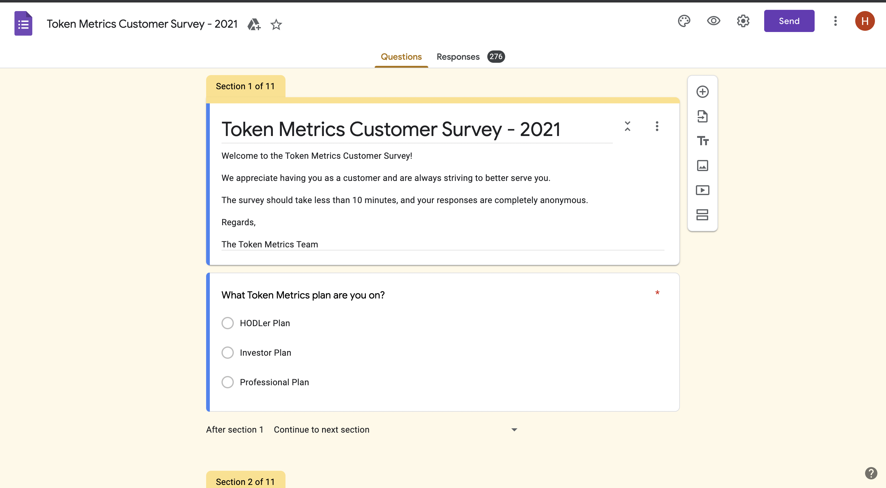
To validate the qualitative insights, we designed and rolled out a survey to get a reply from 250+ users
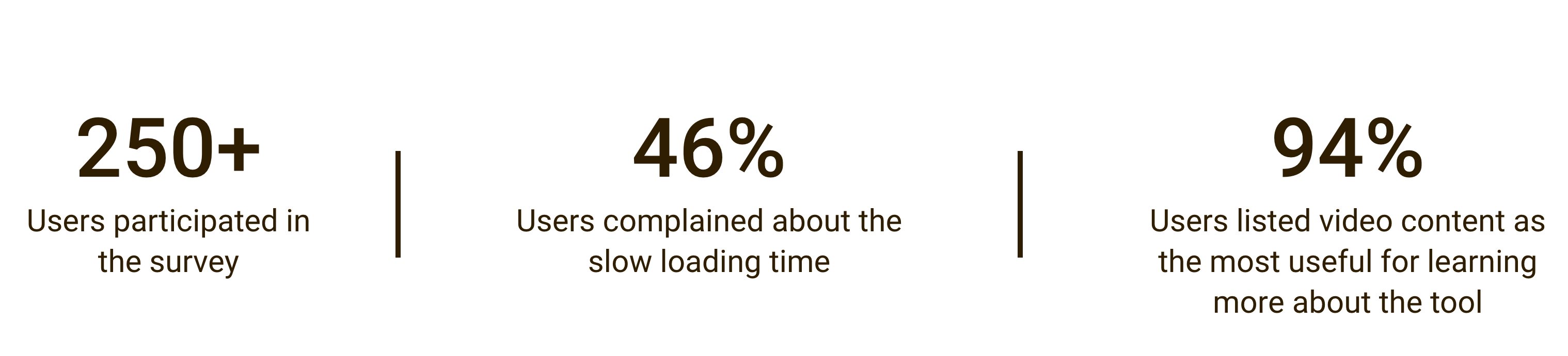
Summary of Quantitative Insights
Brainstorming
In order to have everyone on the same page after the research and finalize the goals we are trying to achieve from the redesign, we ran a brainstorming workshop with the CEO, CTO, Product Managers, and Data Scientists.
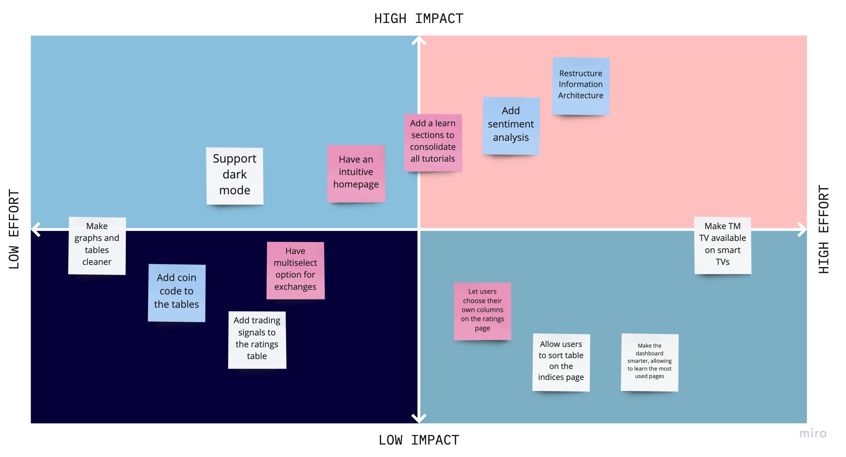
Effort vs Impact brainstorming workshop
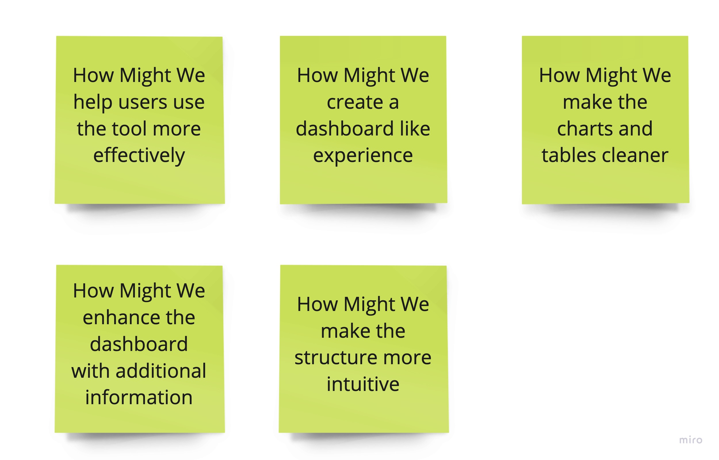
Recognize Opportunities
Goals
- Restructure the information architecture
- Support a dark theme
- Have a dashboard-like experience by hvaing a definite landing page
- Allow the users to make the most out of the dashboard by adding tutorials and documentation
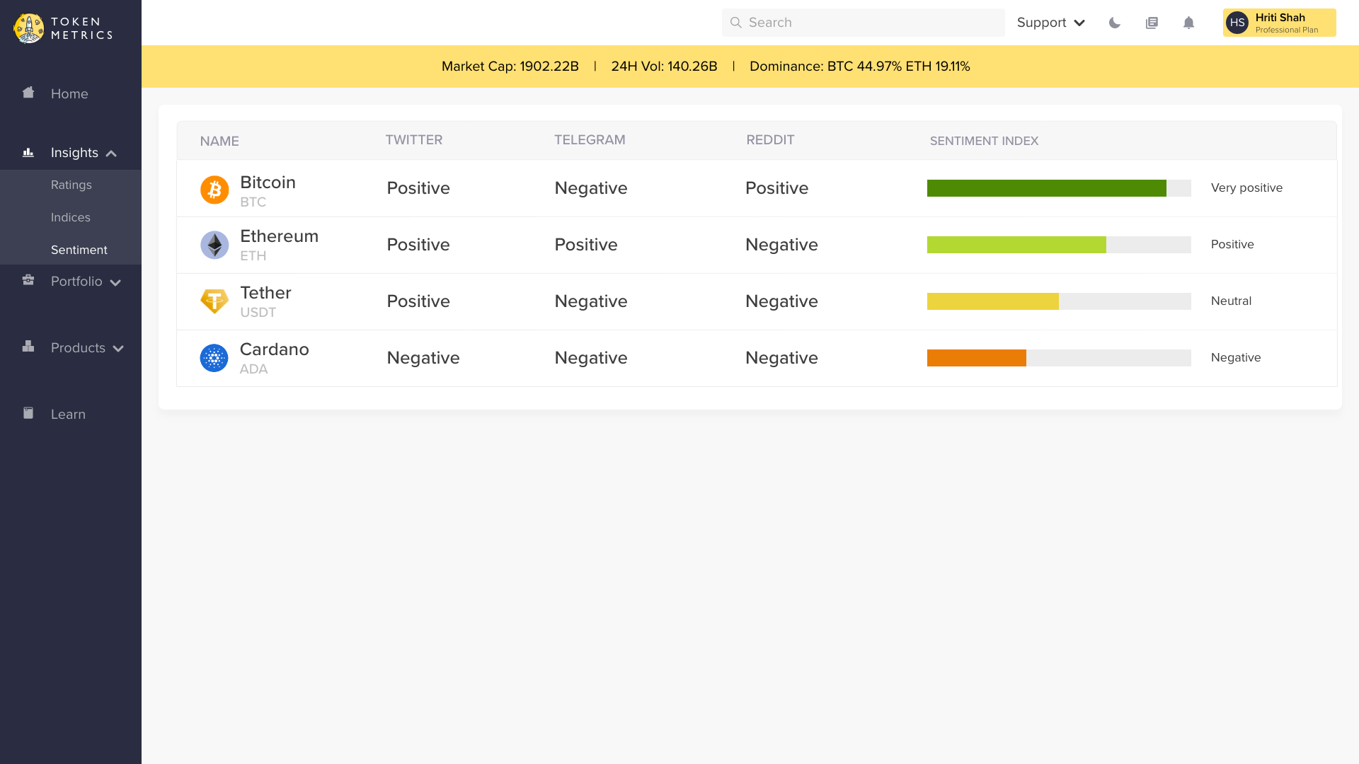
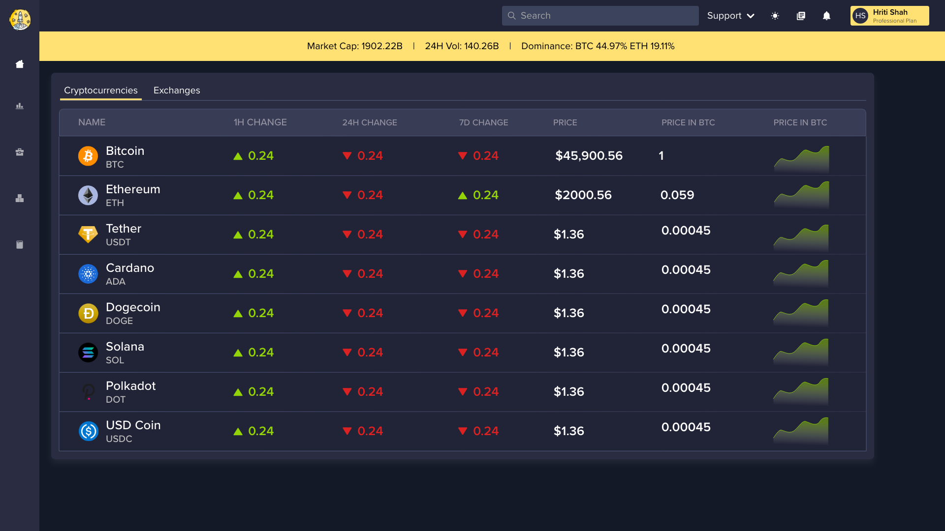
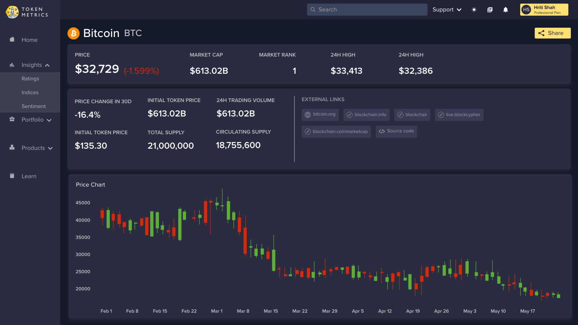
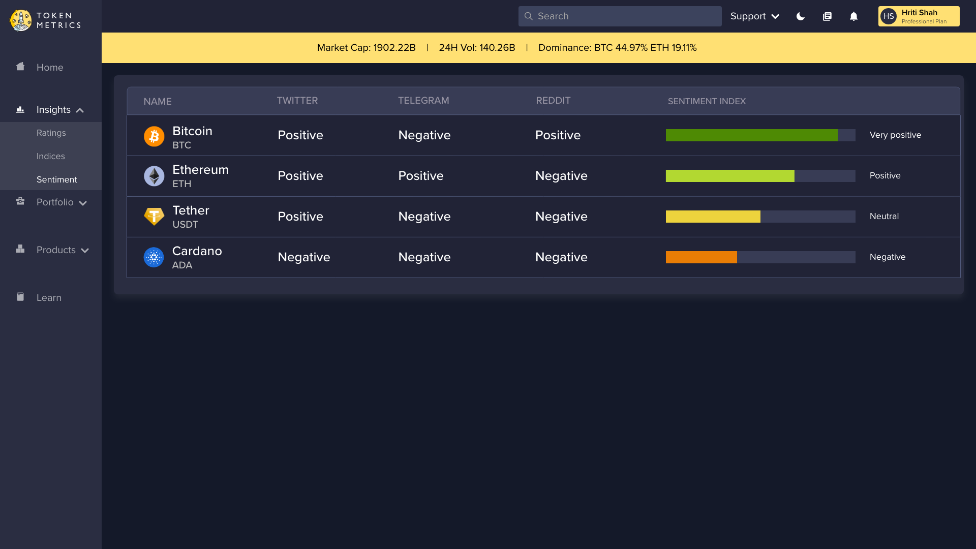
- Refine the graphs and tables
Design
Information Architecture
Based on the user needs and the opportunities recognized, we created an information architecture.
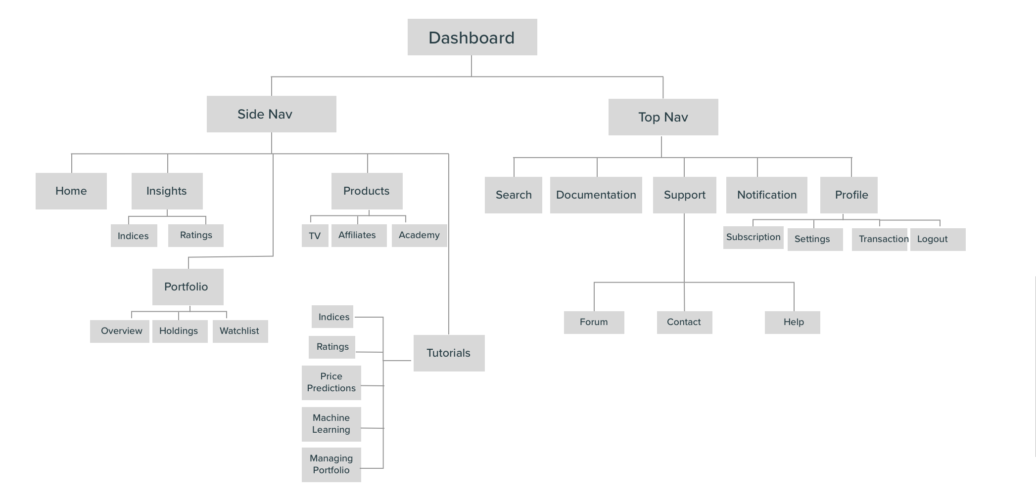
Basic Information Architecture
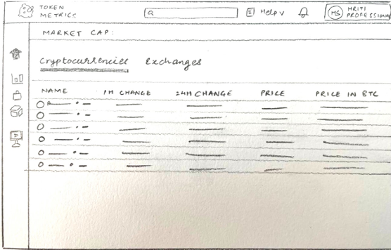
Paper Prototypes
Once ready with the information architecture, we created the following paper prototypes. These helped us brainstorm several options for the given information architecture.
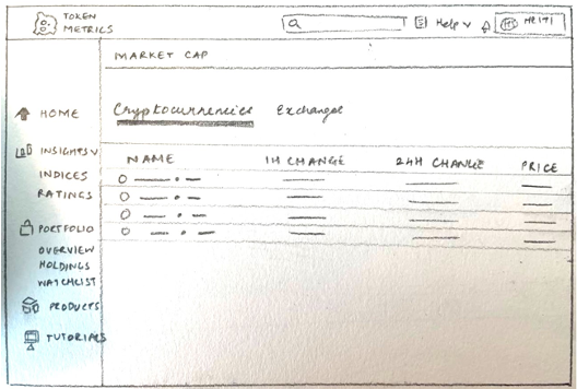
Low-Fidelity Prototypes
After brainstorming a few versions of the paper prototypes, we designed the low fidelity prototypes.
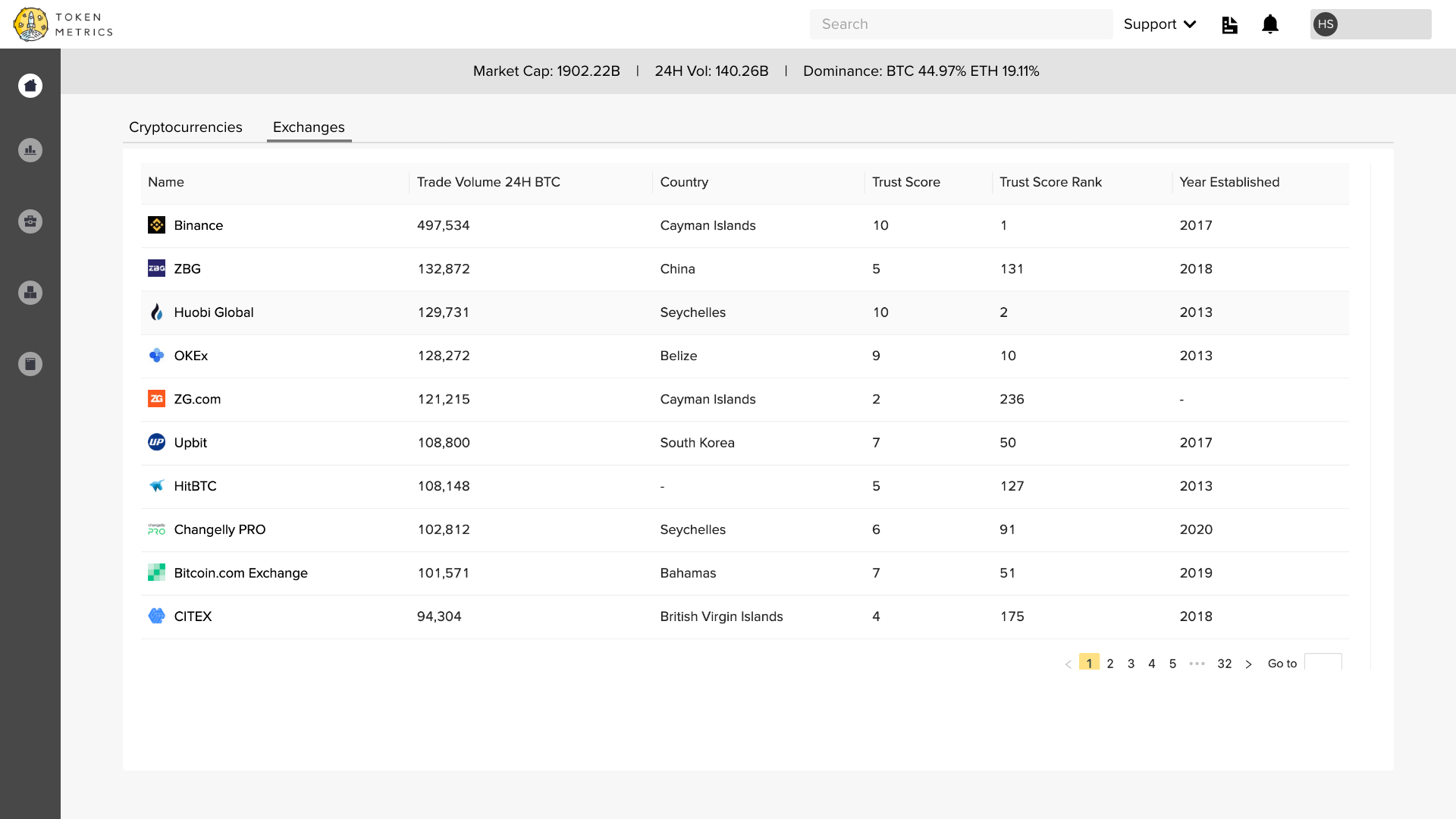
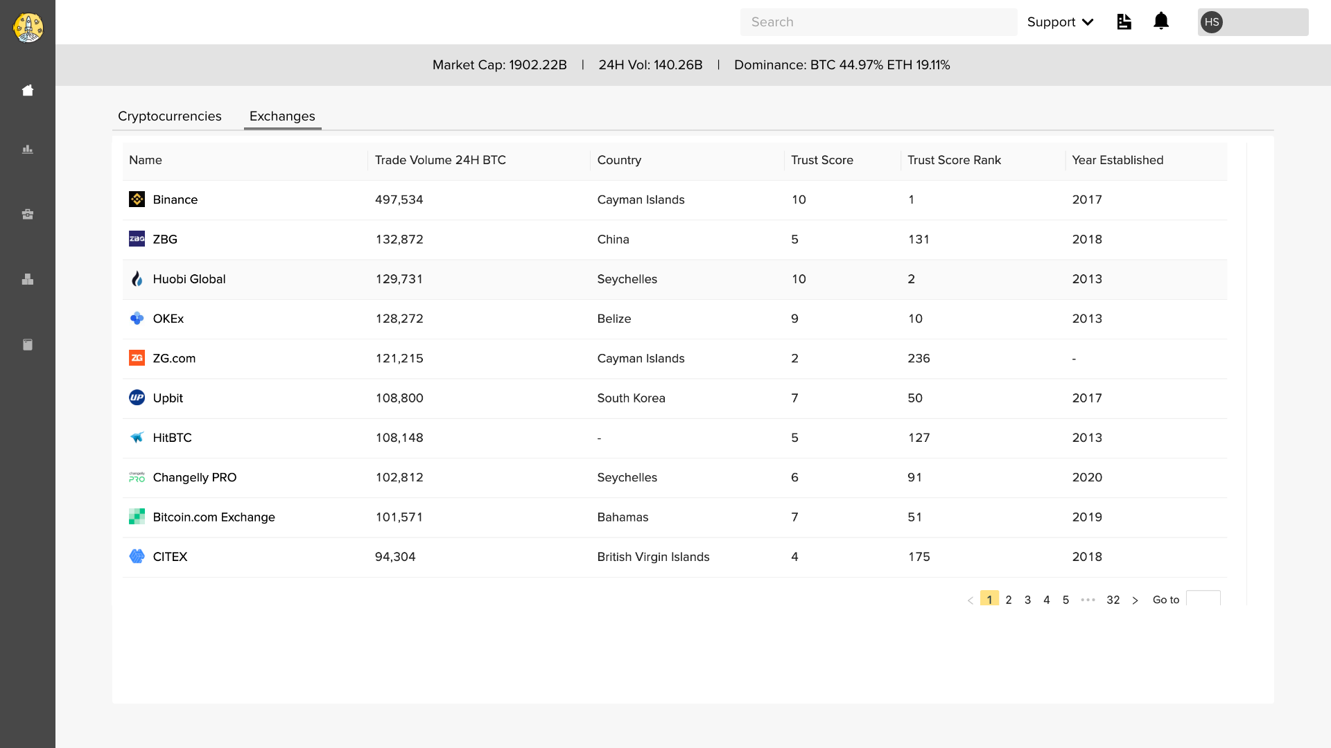
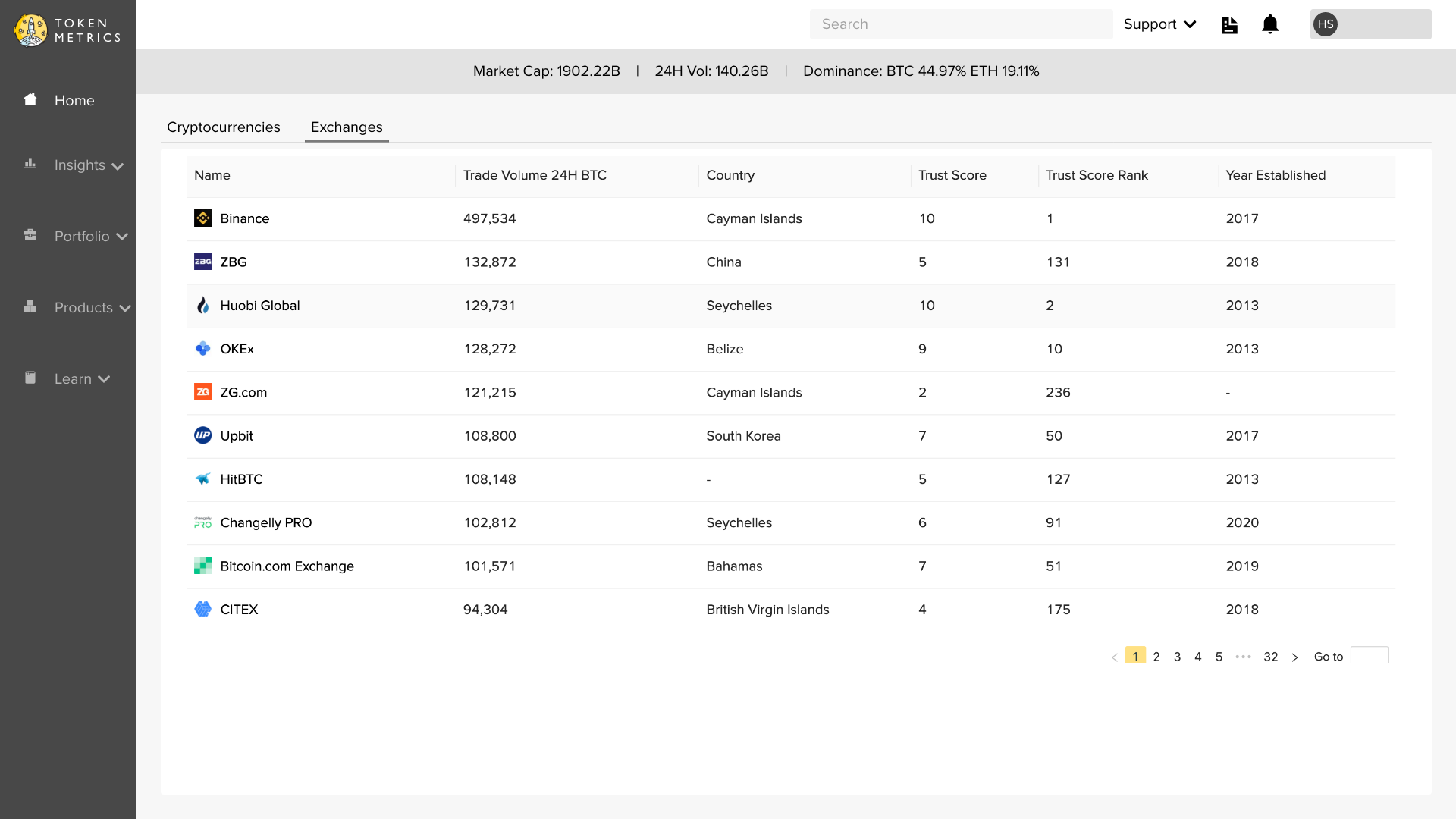
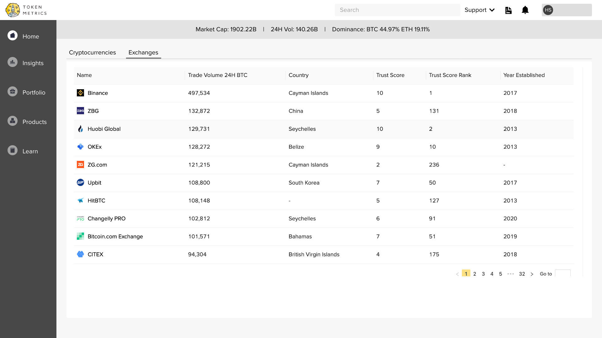
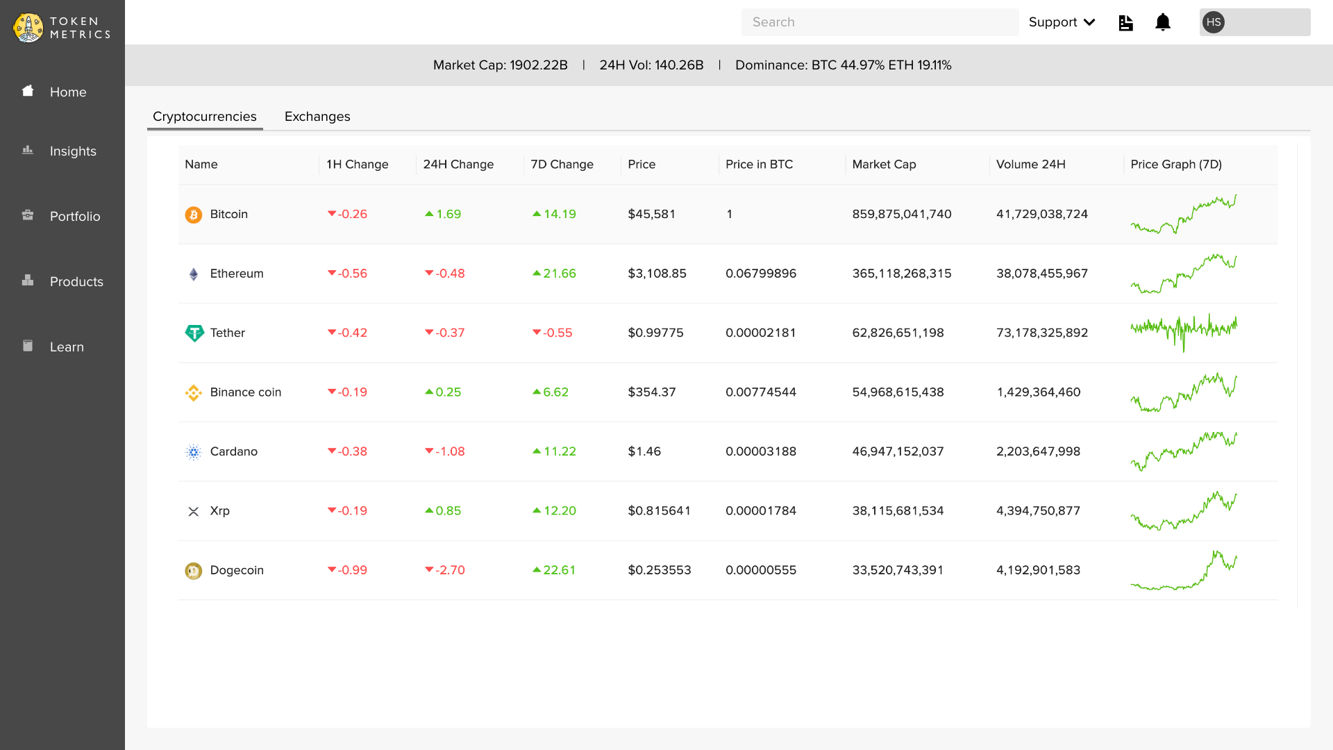
High-Fidelity Prototypes
After brainstorming a few versions of the paper prototypes, we designed the low fidelity prototypes.

Evaluate
User Testing
Once the high-fidelity prototypes were ready, we tested the same internally to gain feedback. After the testing, the following things were discovered.
- Though the pages were considerably fast, a few tables took a long time to render
- Integration of TM TV into the TM Dashboard was also requested